
Matching coloring-page complexity to a child's age
Updated 2026-07-26 · 5 min read
Use the age bands as a starting point, then adjust for the child’s preferred tools, patience and fine-motor control.
Younger children need thicker outlines and larger areas. Toddlers (2–3) do best with a few very large shapes and bold lines; preschoolers (4–5) can handle several medium shapes; early primary (6–8) enjoy more detail and smaller areas; older kids (9+) can manage intricate scenes. Matching complexity to fine-motor skill keeps coloring rewarding rather than frustrating.
Choose by what you want to do next
Choose an easy design
Start with a familiar subject and larger spaces when you need a page that can be finished comfortably.
Browse easy pages →Make a custom page
Generate a subject the child already cares about, then keep the line detail deliberately simple.
Create a kids page →Why complexity should track age
Coloring is partly a fine-motor exercise. A page that asks for more control than a child has yet developed leads to frustration; a page that is too simple loses their interest. The goal is a gentle stretch — areas small enough to be interesting but large enough to fill with success.
These bands are guides, not rules. Children vary widely, and a confident four-year-old may prefer pages aimed higher. Watch how a child engages and adjust.
A practical age-to-complexity guide
Use these as starting points and move up or down based on the individual child.
- Toddlers (2–3): a few very large shapes, thick bold outlines, simple recognizable subjects (a single apple, a big fish).
- Preschool (4–5): several medium shapes, still-generous outlines, friendly characters and everyday objects.
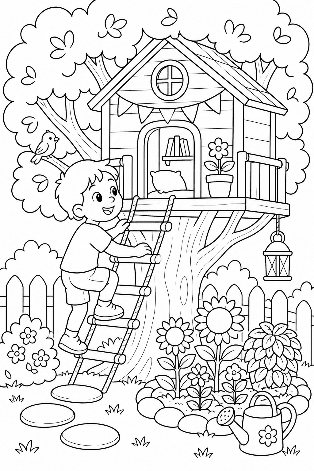
- Early primary (6–8): more shapes and moderate detail, thinner lines, simple scenes with a background.
- Older children (9+): detailed subjects, finer lines, patterns and fuller scenes to color.
Browse easy coloring pages for a simpler start · Generate a page around a child’s interest
The two dials that matter most
When you adjust a page for a younger child, you are really turning two dials: line weight and area size. Thicker outlines give a clear boundary to stay inside, and larger areas forgive imprecise strokes. Detail is secondary — a simple subject with a few big areas beats a 'cute' subject chopped into tiny pieces.
When you generate pages, choosing a kids or classroom preset nudges both dials toward thicker lines and larger areas automatically, but you can always ask for 'simple, large shapes, thick outlines' explicitly for the youngest colorists.
FAQ
My child gets frustrated halfway through — what should change?
Usually the areas are too small or too numerous. Drop to a page with fewer, larger shapes and thicker outlines so each section is a quick win.
Are detailed pages bad for young kids?
Not bad, just often discouraging. If a young child loves a detailed subject, look for a simplified version of it rather than the intricate one.
How do I make a page simpler for a toddler?
Ask for large shapes, thick bold outlines and a single clear subject, and skip busy backgrounds.