Best AI Coloring Page Generators and Coloring Tools
Updated 2026-09-09 · 18 min read
By the Love to Color team. Our recommendation prioritizes audience-specific creation and color inspiration. Screenshots distinguish hands-on checks from existing product examples; review details appear below.
Love to Color is our first pick for creating a page for a particular person and getting help with the colors afterward. Its Kids, Classroom and Adult workflows address different kinds of line art, while 12 curated palettes lead to an optional finished color reference. We also examine ColorPage.ai, ColorPenguin and Coloring.at for quick idea generation, age-based creation and geometric mandalas.
The workflow in three decisions
- 01Choose a generator by the page you need: big colorable spaces for a child, a clear learning task for a class, or a deliberate pattern for an adult.
- 02An online paint bucket, an artistic coloring effect and a palette-led color reference solve different problems.
- 03Check the finished workflow, including sign-in, download access and color-reference costs, before committing to a tool.
Key differences at a glance
| Tool | Why choose it | What to check |
|---|---|---|
| 1. Love to Color | Best for the full journey: audience-specific line art → palette choice → colored reference. | Choose Kids, Classroom or Adult. Color-reference generation is a separate step with its own access requirement. |
| 2. ColorPage.ai | A quick idea-to-page starting point with an anonymous generation demo. | The public form includes age and style. Review the actual small regions and any gray shading before printing. |
| 3. ColorPenguin | Age-based creation for people who want a general-purpose coloring generator. | Check account access, watermark and privacy settings. We inspected its public workflow, not a completed signed-in generation. |
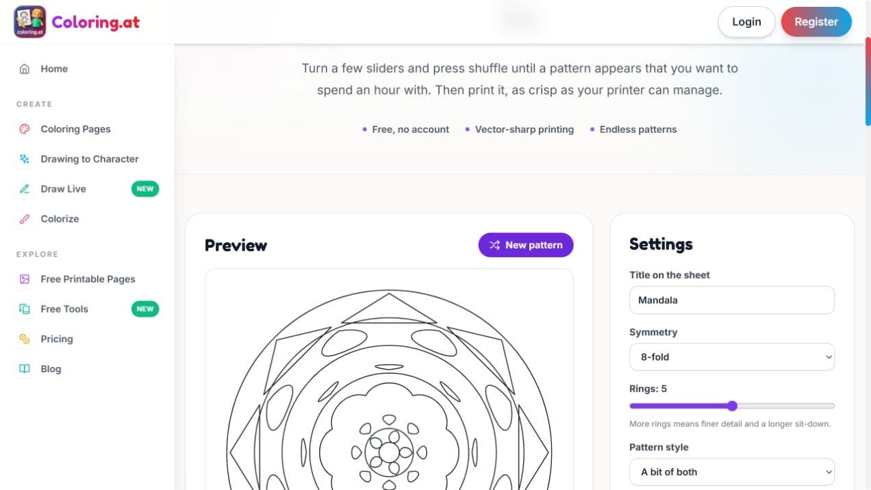
| 4. Coloring.at | Direct geometric mandala controls, with a separate upload-based AI colorizer. | A symmetry-and-rings generator is different from describing botanical motifs. The colorizer requires sign-in. |
What makes a coloring tool worth using?
A good coloring-page generator should get you to an activity you actually want to finish. That means more than producing black outlines: the spaces should fit the person coloring, the subject should remain recognizable, and the next step should be obvious when you are ready to print or choose colors.
Imagine a fox reading beneath a tree. A child may want a large fox and a few easy leaves. A teacher may want a clear reading-themed activity. An adult may enjoy layered foliage and repeated patterns. After generation, any of them might still wonder which colors will work together.
We chose four focused coloring tools and compared the decisions each asks you to make. Love to Color comes first because this guide values the combination of audience-specific creation and practical color inspiration. The order is a workflow recommendation, not a numerical image-quality league table.
Several alternatives also serve children and adults, and some offer automatic coloring. The useful distinction is how those choices work together: a general age selector, a dedicated classroom task, a geometric pattern maker and a palette-guided reference each solve a different part of the problem.
Start with words, a photo or an existing coloring page
Text-to-coloring generation fits an imagined scene: a dinosaur birthday, a seed growing into a flower, or a botanical mandala. The important input is what should appear and who will color it. Begin with one subject, one action and a setting; add detail only when it serves the activity.
Photo-to-coloring conversion fits a particular person, pet or memory. Look for a recognizable silhouette and useful spaces to fill, not simply a large number of traced edges. Hair, grass and a busy background can turn into distracting texture. Review faces and small shapes before printing.
If you already have good line art, your next tool may be a colorizer. You can keep the black-and-white page for paper coloring and create a separate reference to guide your choices. For a quick activity with no custom subject, a ready-made printable library may be enough.
Compare coloring pages with detailed line drawings · Convert a photo · Browse ready-made coloring pages
1. Love to Color: our best pick for audience fit and color inspiration
Our reason for recommending Love to Color first is the combination of two decisions: make a page for the person using it, then choose a color direction before committing pencil to paper. The generation workspace separates Kids, Classroom and Adult creation, and the color-reference workflow provides 12 curated directions.
That matters because more detail is not automatically better line art. A young child needs spaces that a crayon can fill. A teacher needs the intended concept to remain obvious. An adult choosing a mandala may want repeating motifs and a density that matches the time they want to spend. Those are different design requests even when all three begin with the word ‘flowers.’
Love to Color is particularly useful when you want one custom page and a visual plan for coloring it. If your main goal is compiling an entire book, or freely painting with a brush on screen, compare the dedicated alternatives below before choosing.
Three people, one subject: why the starting mode matters
Use flowers as a simple comparison. The subject stays constant, but the successful page changes with the activity. A rose with broad petals, a plant-parts learning page and a repeated floral mandala should not all receive the same visual treatment.
This is the first part of Love to Color’s advantage: you choose the job before refining the drawing. The controls carry some of the specification so the prompt can stay focused on the subject. Resolution then determines image clarity; it does not replace a suitable level of complexity.
| Audience | Start with | Inspect the result |
|---|---|---|
| Kids | One favorite subject; a style; Easy, Balanced or Detailed. | Large closed regions, recognizable action and limited clutter. |
| Classroom | One learning topic; ages 3–6, 6–9 or 9–12. | Correct objects or stages, clear grouping and readable visual relationships. |
| Adults | Botanical, scenic, geometric or ornamental direction; desired density. | Coherent repetition, complete edges and small regions that suit the intended materials. |
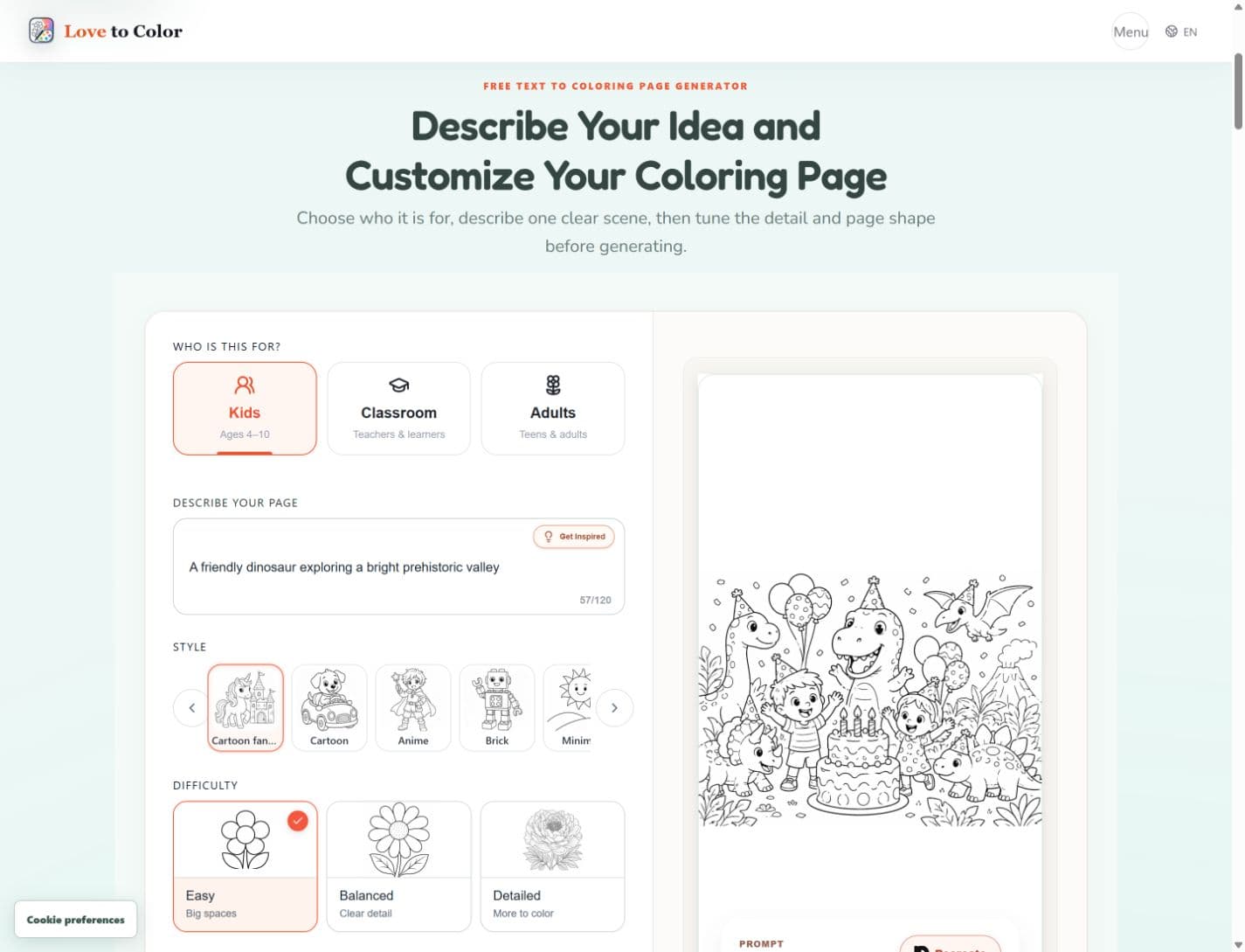
For kids: choose usable spaces as well as a favorite style
In the current Kids form, the practical choices are the scene, an illustrated style and Easy, Balanced or Detailed difficulty. Styles include Cartoon, Minimal, Kawaii, Anime and Geometric, among others. Difficulty is a separate choice: liking a particular character style should not force a child into a dense page.
The distinction goes beyond the labels. Easy requests one main subject, limited supporting objects, bold outlines and large enclosed spaces. Balanced allows more scene detail. Detailed asks for additional closed regions while excluding hatching and stray texture. These are generation instructions, so inspect the actual output rather than assuming every shape will be perfect.
For example, start with ‘A friendly fox reading under an oak tree, with two mushrooms and a few large leaves.’ Choose a simple style and Easy for a short crayon activity. Before downloading, check whether the fox is prominent, the book reads clearly and the leaves are large enough to fill. A more elaborate background is useful only if the child wants more to color.
Create a page for a child · Choose a suitable coloring-page difficulty
For teachers: start with a learning theme and an age band
Classroom creation starts from what you want to teach, such as ‘Life cycle of a butterfly,’ and an age band: 3–6, 6–9 or 9–12. The current form does not require you to write a complete illustration specification or navigate a long list of subject and worksheet-format dropdowns.
Behind that input, the classroom workflow builds a lesson-oriented plan and a visual arrangement. It can organize a single scene or a process sequence, with rules for subject counts, positions and separated learning areas. The age choice adjusts the requested concepts and coloring-space complexity. This is more specific than asking for a decorative butterfly and hoping it becomes a lesson.
The useful classroom check is whether pupils can identify the intended idea from the picture. For a life cycle, inspect the stages and their order. For counting, count the objects yourself. The output is a visual teaching aid; review the facts, and add your own spoken or written instructions where needed. Do not assume AI line art supplies a verified curriculum or perfectly rendered labels.
Create a classroom coloring page · Plan a classroom coloring activity
Classroom close-up: a butterfly lesson is more than a butterfly picture
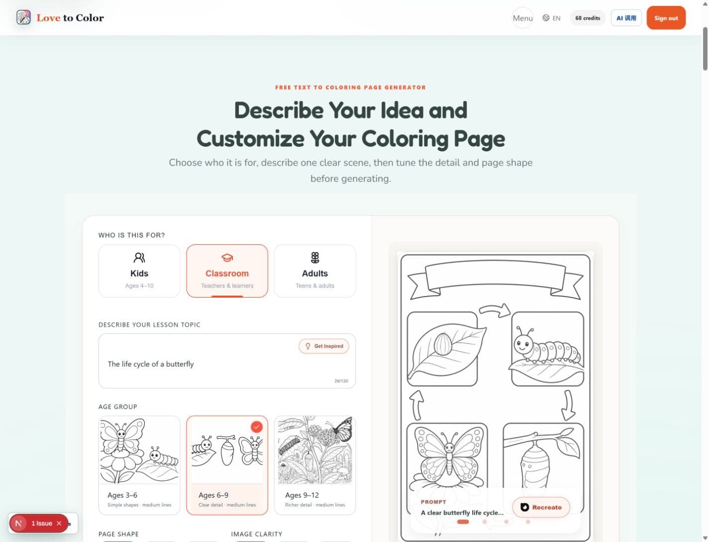
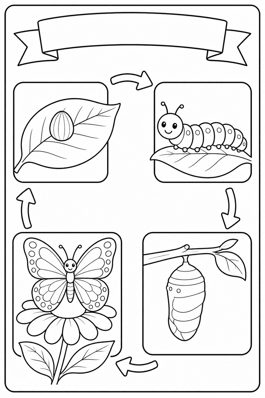
For the topic “The life cycle of a butterfly,” success means showing a process. A single decorative butterfly might be beautiful but would leave the teacher to supply the missing stages. In a lesson-oriented workflow, the arrangement is part of the request.
The existing ages 6–9 preview below divides the activity into four regions. That separation gives pupils somewhere to focus while the teacher discusses each stage. It also creates a simple way to check the page before class: identify the egg, larva, pupa and adult, then follow the intended sequence.
For younger children, use the page to talk about and recognize the stages rather than adding lots of extra labeling. For an older group, ask pupils to explain what changes between stages. The same topic can support different activities; the illustration should leave room for that teaching choice.
Our practical review rule is to check learning content before visual polish. If a stage is missing or a sequence is misleading, a pleasing layout does not make the page classroom-ready. Review any generated teaching aid before sharing it with pupils.
For adults: choose the pattern and the amount of detail
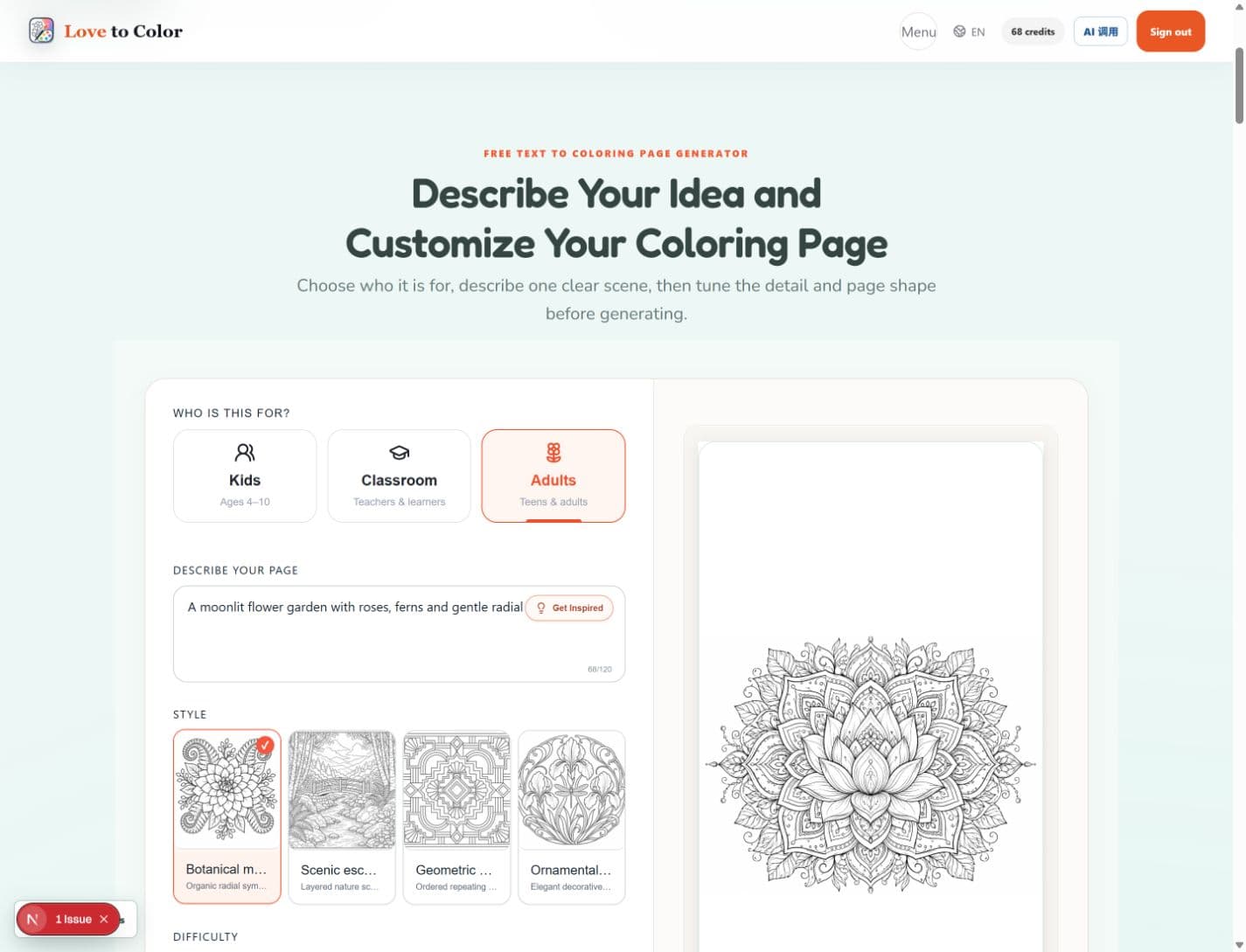
Adult creation offers Botanical Mandala, Scenic Escape, Geometric Pattern and Ornamental Design. The complexity options are Easy, Balanced and Detailed. A mandala is therefore a design direction you can combine with an intended density, rather than a synonym for ‘make everything tiny.’
For a request such as ‘A botanical mandala of peonies and fern fronds,’ the mandala direction asks for a clear center and rhythmic botanical repetition. An open complexity setting requests larger regions and breathing room; an intricate setting allows more detail. Use the preview to see whether the smallest regions suit your pencils and patience.
We would begin with Balanced when the desired detail is uncertain, then judge the pattern at the size it will be printed. Check repeated petals, crowded intersections and the outer edge. This is a practical choice about the activity you want, not a promise that the image will have a particular emotional or health effect.
Create an adult coloring page or mandala
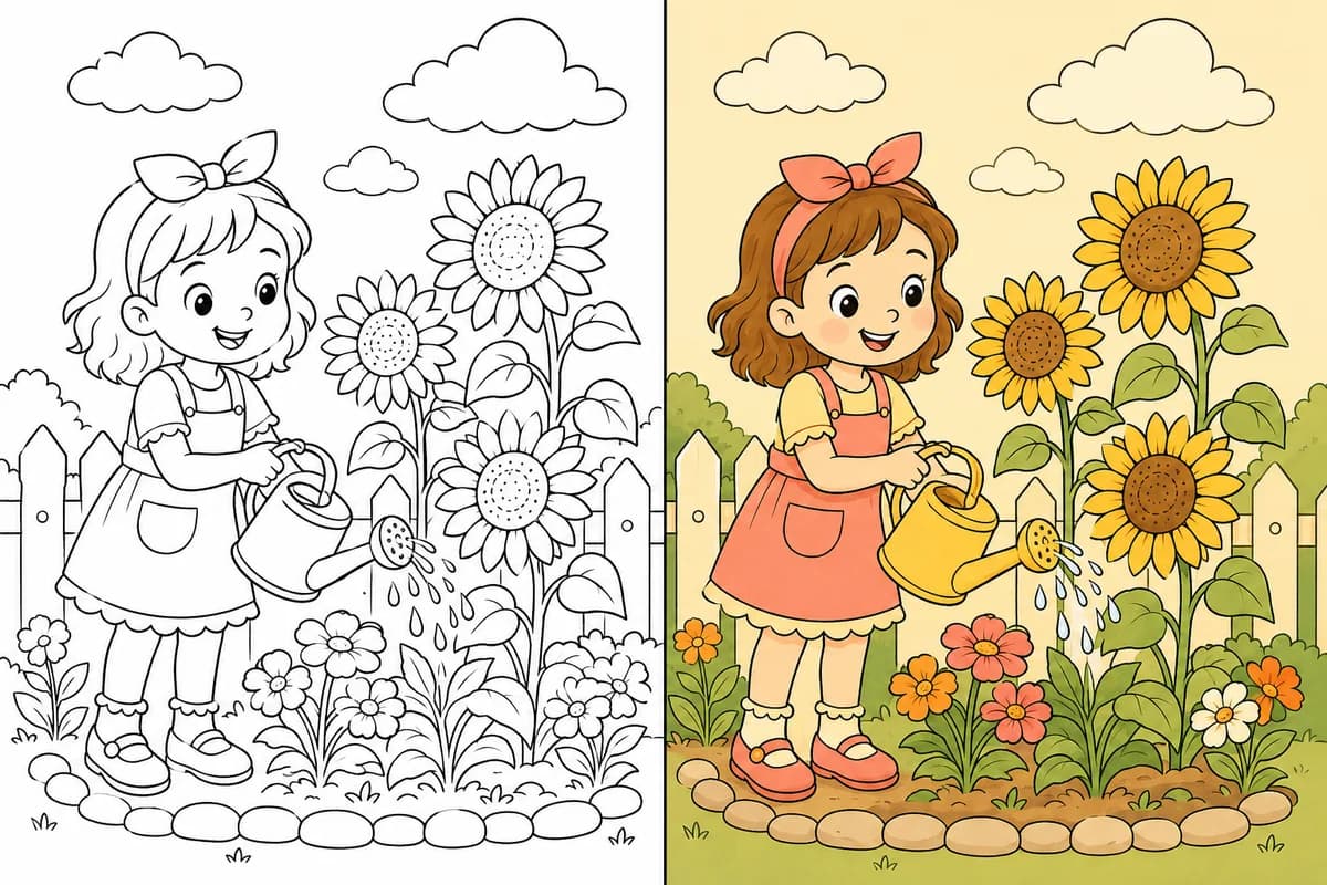
After the outline: 12 directions for deciding how to color it
This is the second reason Love to Color leads our shortlist. The palette step gives you a manageable starting point when an empty page feels harder than the drawing itself. You choose a direction, then generate a colored reference for your line art. Keep that reference beside the uncolored page while you work.
The 12 directions cover Complementary, Analogous, Triadic, Split Complementary, Tetradic, Monochrome, Warm, Cool, Pastel, Earth Tones, Jewel Tones and Retro. The interface also uses descriptive names such as Balanced Contrast, Soft Harmony and Natural & Earthy to help you choose without knowing color theory.
These are curated presets. Browsing the directions does not generate 12 custom versions of your page. A personalized color reference is a separate creation after you choose, and it requires sign-in and paid access or an eligible allowance. Check the price or credit requirement shown before creating another version.
For a garden scene, Natural & Earthy is a useful starting point if you want olive greens and browns; Soft Pastel suits a lighter interpretation. In the example below, warm clothing and flowers attract attention while quieter greens support the scene. The important benefit is seeing where colors go, not just receiving five attractive swatches.
To use a reference on paper, first identify the main subject color, a supporting color and a small accent. Test nearby pencils on scrap paper and repeat those roles across the image. You do not need an exact digital-color match. The reference is inspiration, not a numbered paint-by-number map, a pencil-brand recipe or a guarantee that the AI preserves every tiny contour.
Create a color reference for your line art · Use a palette when coloring a mandala
A visual guide to all 12 palette directions
If color theory terms feel abstract, begin with the appearance you want: warm, cool, soft, earthy or richly saturated. The cards below use the actual five-color preset values in Love to Color. Each note suggests a starting use, not a rule about how the image must be colored.
The choice becomes easier when you compare a few plausible directions for one subject. For the reading fox, start with warm colors for an autumn mood, earth tones for a woodland interpretation, or complementary blues and orange for stronger separation between the fox and its surroundings. A finished reference makes the placement visible.
Blue and orange separate a warm subject from cooler surroundings.
Related golden and coral hues keep a scene visually connected.
Red, yellow and blue families offer clear variety for playful scenes.
A blue base with warm accents gives several ways to separate objects.
Several lively hue families suit scenes with many distinct objects.
Warm neutral value steps focus attention on light and dark.
Coral, apricot and honey are a natural starting point for autumn scenes.
Layer coastal blues from dark focal areas to pale backgrounds.
Pale pink, blue, yellow, green and lilac suggest a lighter finish.
Olive, brown and stone shades work well as a woodland starting point.
Deep ruby, emerald and blue can emphasize repeated mandala motifs.
Mustard, olive and rust suggest a restrained vintage interpretation.
From a palette to something you can actually copy on paper
A palette answers “which colors belong together?” A colored reference answers an additional question: “where could those colors go in this drawing?” That second decision is often what holds up a beginner after the line art is ready.
Keep the uncolored original and treat the reference as a separate guide. Before starting, choose the closest pencils or markers you own. Mark a small test patch for the main color, supporting color and accent. Then repeat those roles across similar objects or repeated mandala rings.
For example, use an orange family for the fox, quieter colors for the tree and leaves, and a small contrasting accent for the book. You can simplify shadows or leave the background white. Following the large color relationships is more practical than trying to reproduce every digital gradient.
| Step | Decision | Useful outcome |
|---|---|---|
| 1 · Create or upload | Choose the audience and subject, or bring existing line art. | A black-and-white page to inspect and keep. |
| 2 · Pick a direction | Browse the 12 curated five-color palettes. | A coherent family of colors before you commit to paper. |
| 3 · Create a reference | Generate a finished look using the selected palette. | A visual suggestion for distributing colors across the drawing. |
| 4 · Color your page | Match approximate materials and repeat the main color roles. | A personal finished page guided by the reference. |
2. ColorPage.ai: a quick first page from a written idea
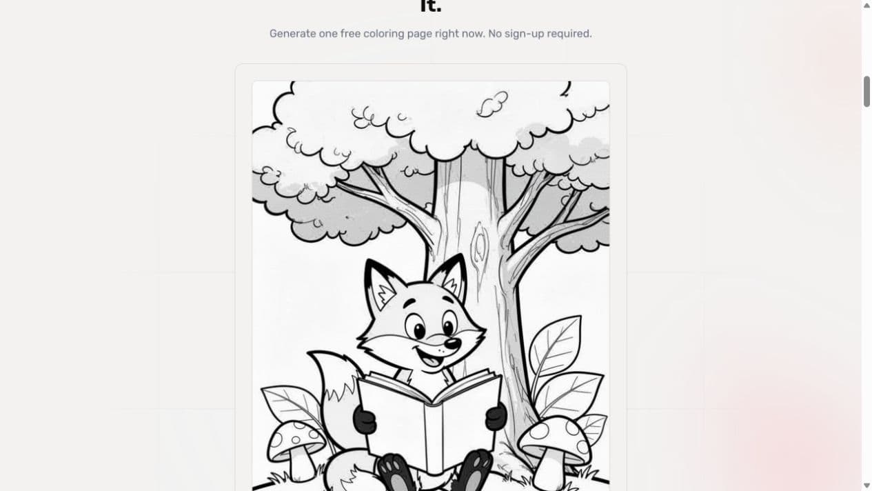
ColorPage.ai offers a public demo with a text prompt, style and age group. We entered the fox-reading prompt, left Style on Auto and Age Group on Preschool 4–5yo, and completed a free generation without creating an account. The result screen exposed a download action.
In this result, the fox, open book, tree and two mushrooms are easy to recognize. The book provides a large area to color. The tree adds fine bark marks and some gray shading, while the face and mushroom spots introduce smaller spaces. We would inspect those details at print size before choosing it for a very young child.
Its appeal is a short route from an idea to a page. For the combined task in this guide, we prefer Love to Color’s explicit audience workflows and the next-step palette choices. This one demo does not establish either tool’s consistency across subjects or retries.
3. ColorPenguin: a straightforward age-based approach
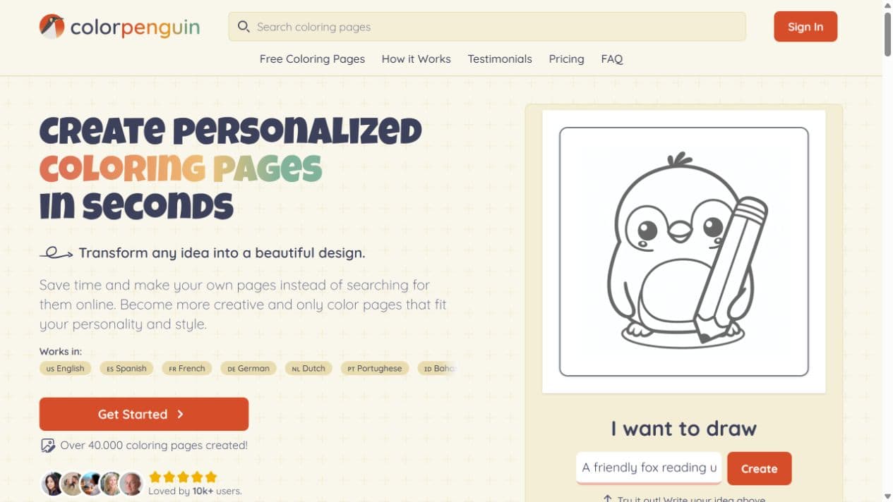
ColorPenguin presents a general-purpose creation workflow and describes age choices for preschoolers, older children, and teens or adults. That is a meaningful distinction: it already recognizes that different people need different amounts of detail.
We entered the fox prompt in its public homepage input and inspected the advertised creation and export steps. This review covers that entry flow and its published options, not a completed signed-in output. The page also describes PNG and PDF export, with plan-dependent access.
The main decision is whether an age-based general workflow is enough. For an everyday animal page, it may be. For a teacher turning a topic into a learning activity, or someone who needs a color plan after generation, Love to Color makes those tasks more explicit. Check the free plan’s public-image and watermark conditions before using a personal subject.
4. Coloring.at: direct controls for geometric mandalas
Coloring.at is especially useful to compare because its mandala maker takes a different approach. Instead of describing a scene, you control geometric settings such as symmetry, rings and pattern style. Its public maker also exposes line weight and paper settings, with a PDF download action.
That is a good fit when the main requirement is a repeating geometric structure. Love to Color’s botanical mandala direction is more relevant when the request contains recognizable motifs, such as peonies and fern fronds, and you want to guide density alongside the subject.
Coloring.at also offers a separate AI colorizer for uploaded line art. We inspected that public entry page; it requires sign-in, and we did not complete a colorization there. Its existence matters: automatic coloring is not exclusive to Love to Color. Our recommendation centers on the visible set of 12 palette directions and the path from a chosen direction to a reference.
Compare the decisions, not just the feature names
“AI generator” and “coloring tool” cover several different experiences. This comparison records the controls and public paths we inspected. “Not verified” means the inspected flow did not establish the capability; it is not a claim that a service can never offer it.
| Tool | Creation controls | Color-planning path |
|---|---|---|
| Love to Color | Separate Kids, Classroom and Adult workspaces; audience-specific inputs. | 12 curated directions, followed by a separately generated reference. |
| ColorPage.ai | Public text demo with style and age-group selectors. | A palette-led reference was not verified in the demo result flow. |
| ColorPenguin | Public workflow describes age-based creation and export. | A palette-led reference was not verified in the inspected public flow. |
| Coloring.at | Procedural mandala symmetry, rings and pattern controls. | Separate upload-based AI colorizer; sign-in required. |
Online coloring, AI colorization and palette inspiration: which do you need?
For an on-screen activity, choose a manual coloring tool. You decide the color and place it with the available fill or drawing controls. That creative control is useful when you already know what you want, but a blank color picker may not solve uncertainty about the overall scheme.
For an automatically colored image, choose an AI colorizer. Some tools emphasize a medium such as watercolor; others emphasize palette choices. Either can produce inspiration. Compare whether the workflow gives you useful control over color relationships, texture and the parts of the original drawing you need to preserve.
For coloring on paper, judge the reference by how easily you can follow it. Can you pick out a dominant color, a supporting family and a few accents? Are the important regions still recognizable? A simpler reference may be more useful than a spectacular image filled with subtle gradients that your materials cannot reproduce.
A practical check before you choose a generator
If you try two tools yourself, hold the subject constant and change only the settings relevant to the task. Our example prompts below are a repeatable evaluation checklist, not a claim that every listed service completed these runs. Keep the first result as well as any retry so you can judge how much work the tool required.
- Child's activity: a fox reading under an oak tree, with two mushrooms and a few large leaves. Check the smallest spaces, overlapping shapes and whether the fox remains the focus.
- Classroom activity: the life cycle of a butterfly for ages 6–9. Check stage identity, order and clarity; attractive decoration cannot compensate for an incorrect learning sequence.
- Adult page: a botanical mandala of peonies and fern fronds. Check the center, repeated motifs, outer margin and whether the density fits the intended coloring session.
- Color reference: use one line drawing and one stated color direction. Check palette coherence, region recognition and whether you can approximate the result with the materials you own.
- Finish the journey: confirm download or print access and inspect one page at actual print size. A preview alone does not demonstrate that the whole workflow meets your needs.
Check what ‘free’ includes before starting
A free printable library, a free generated preview and a free high-resolution download are different offers. So are free manual coloring and AI-generated color references. Read the button and access notice for the step you actually need, rather than assuming a homepage's ‘free’ label applies to everything.
Love to Color offers an anonymous watermarked generation preview. Download and print access depend on unlocking the creation, and a custom color reference has separate access requirements. ColorPage.ai’s public demo completed one anonymous generation in our check. ColorPenguin describes a free account allowance with restrictions; Coloring.at separates its free mandala maker from its sign-in colorizer.
For the combined task this guide covers, start with the decision that is holding you back. If the page does not yet exist, choose the appropriate Love to Color audience mode. If the outline is already good and color choice is the difficult part, go straight to the palette workflow. You do not need to regenerate a useful drawing just to plan its colors.
How we reviewed these tools
Review date: September 9, 2026. We inspected the current Love to Color interface and the implementation behind its role-specific controls, entered a Kids prompt and completed a line-art generation. We also captured the Classroom and Adult setup screens. The classroom worksheet and garden before/after illustration are existing product examples and are labeled accordingly.
We completed one anonymous ColorPage.ai generation with the same fox prompt. We inspected ColorPenguin’s public input and published age/export workflow, and Coloring.at’s mandala-maker controls and colorizer entry. We did not complete paid competitor generation, a book export or a cross-tool colorization benchmark.
The shared prompt was: “A friendly fox reading under an oak tree, with two mushrooms and a few large leaves.” Love to Color used Kids, Cartoon and Easy; ColorPage.ai used its Auto style and Preschool 4–5yo settings. Those are similar starting intentions, not identical model instructions. One output per tool cannot establish a reliability rate.
We evaluated recognition, region size, learning-task fit, pattern control and the next step after line art. We did not assign invented speed or quality scores. Screenshots show the inspected state; actual access, credits and available controls can change.
FAQ
What is the best AI coloring page generator for beginners?
For beginners who need help with both the drawing and the colors, our pick is Love to Color: choose Kids, Classroom or Adult creation, inspect the line art, then optionally create a palette-led reference. If you only need an existing printable, a free library can be a shorter route.
Does more detail mean a better coloring page?
No. Judge detail against the person, materials and task. Small cells can suit fine pencils but frustrate a child with crayons. For a classroom page, clarity of the learning idea matters more than decorative density.
Does Love to Color generate 12 colored versions at once?
No. It offers 12 curated palette directions to browse. You choose a direction before generating a custom color reference; creating another reference is a separate action subject to the displayed access and cost.
Can I upload a coloring page instead of generating a new one?
Yes. Love to Color's colorizer accepts existing line art so you can create a reference for a page you already have. Use a clear image you have permission to upload, and compare the colored result with the original before using it as a guide.
Is a colored reference the same as color by number?
No. A reference shows an overall color arrangement. It does not assign a number to every region or specify exact pencil brands. Use approximate colors and adapt the result to the supplies you have.
How should I choose an AI mandala generator?
Choose by the kind of control you need. A procedural maker suits direct symmetry and ring adjustments. Love to Color’s Adult workflow suits a described botanical or ornamental subject with a separate difficulty choice, followed by optional palette-led color inspiration.