MANDALA COLOR IDEAS TOOLOriginal lineworkpreserved 12 curatedcolor palettes High-resolutioncolor reference
Mandala Color Ideas & Color Schemes
Explore mandala color ideas, compare coordinated color schemes, and create a finished color reference for your own mandala.
A complete guide to understanding, creating, and coloring mandalas—with an interactive color planning tool.
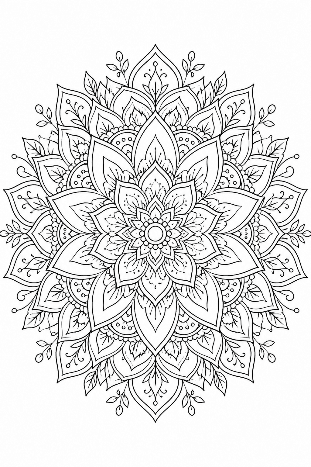
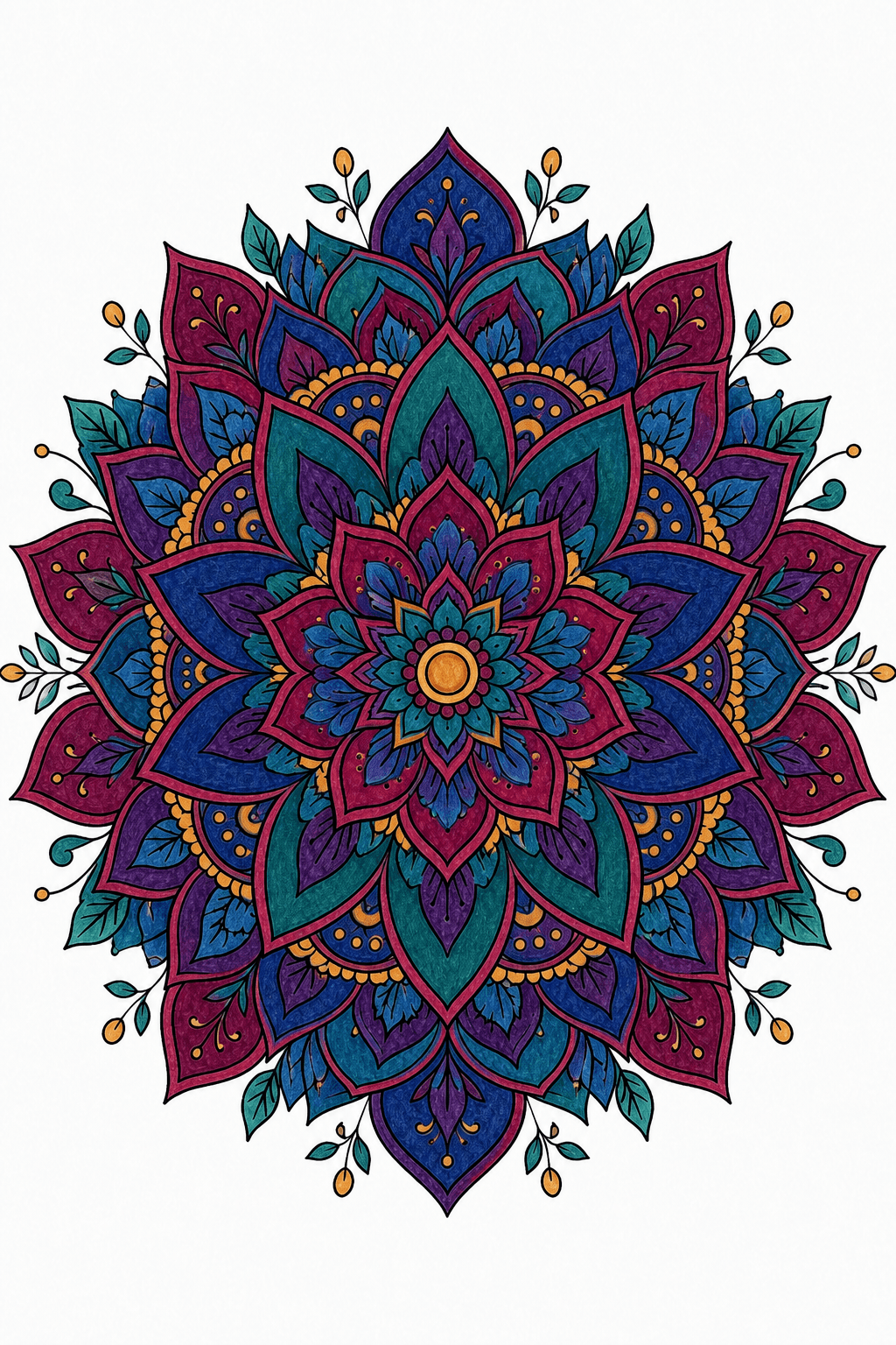
One mandala. A clearer color direction before you begin.
YOUR MANDALA COLORING WORKSPACE
Choose a Color Scheme for Your Mandala
Upload a page you already have, pick a coordinated palette, and create a finished reference while your original line art remains available separately.
Plan the color decision first. Preview the whole mandala before pencil or marker touches paper.
Keep the original line art. The finished look is a separate guide for your coloring session.
Choose Line Art
Generate a Mandala with AI
Line artColored result
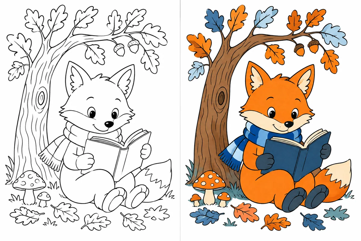
Choose ColorsChoose AI colors or a custom palette after uploading line art.
Smart ColoringAuto-fill harmonious colors for your line artRecommended
Fixed Palettes
 ComplementaryOpposite colors for contrast
 AnalogousNeighboring colors for harmony
 TriadicThree evenly spaced hues
 Split Comp.Base plus two adjacent complements
 TetradicFour hues in a square
 MonochromeOne neutral hue, many values
 WarmComforting coral, apricot, and honey
 CoolCalm coastal blues
 PastelSoft candy-like pastels
 Earth TonesGrounded olive, wood, and stone
 Jewel TonesDeep gem-like richness
 RetroVintage mustard, olive, and rust
Choose or Create a Mandala to Color
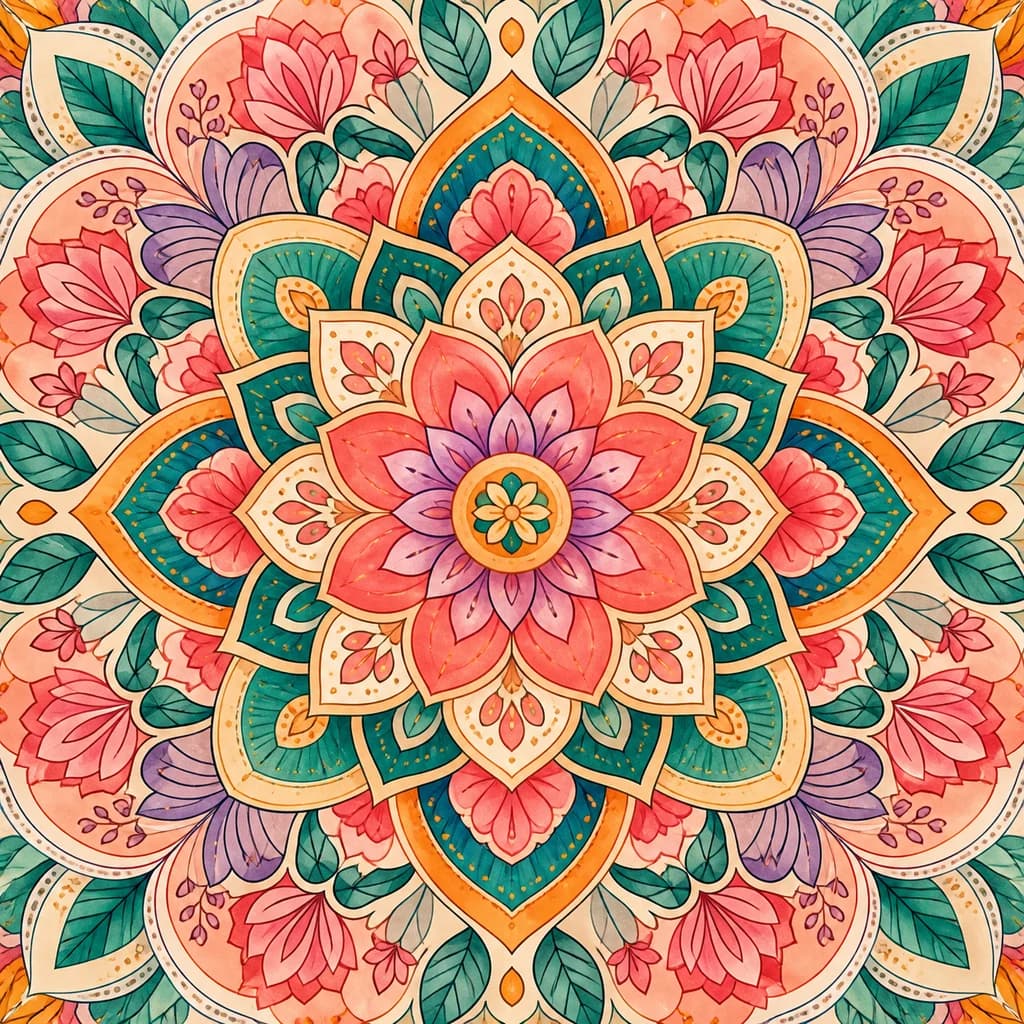
Create an original pattern or choose a printable mandala, then return here to plan the colors.
 PRINTABLE MANDALA
12 MANDALA COLOR IDEAS AND COLOR SCHEMES
12 Mandala Color Ideas and Color Schemes
Explore six color harmonies, three moods, and three themes, then apply your favorite mandala color palette to the tool above.
These are example color directions. Your uploaded mandala generates one finished reference using the palette you select.
LIVE PREVIEWMood
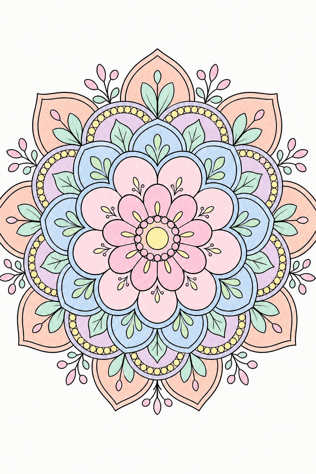
CURRENT COLOR DIRECTION
Cool
Calm coastal blues
CHOOSE FROM 12 CURATED PALETTESCool
Open the mandala colorizerTWELVE STYLES · TWELVE PALETTES · ONE COLOR IDEA
Finished Mandala Coloring Examples
Explore twelve original mandala shapes, each paired with a coordinated palette that turns the same line art into a completely different mood.
01 / PASTEL BLOOMLINE ART → COLOR REFERENCE
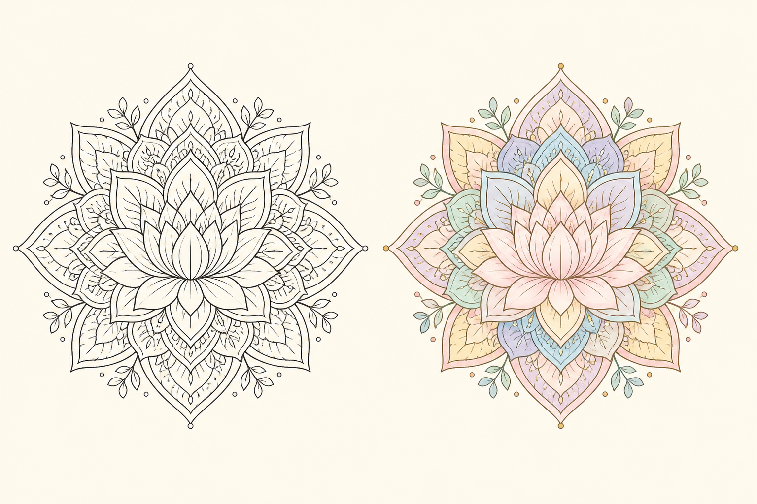
Pastel Bloom
Lotus Bloom
Layered lotus petals and soft botanical details become a calm, airy color direction for slow coloring sessions.
Use this color direction02 / COSMIC JEWELLINE ART → COLOR REFERENCE
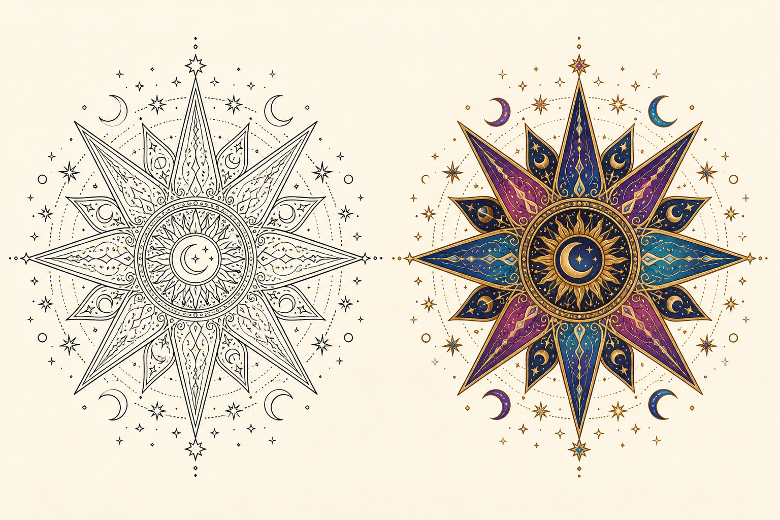
Cosmic Jewel
Cosmic Starburst
Sharp star points, moons, and tiny celestial marks create a high-contrast mandala with a luminous night-sky mood.
Use this color direction03 / DESERT EMBERLINE ART → COLOR REFERENCE
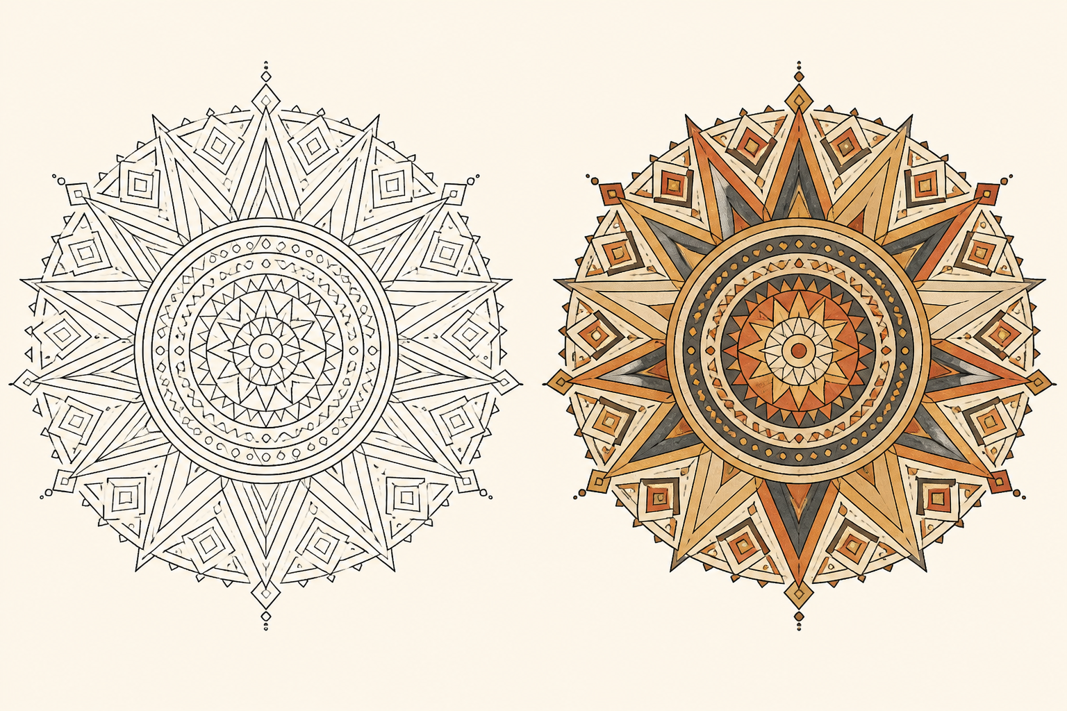
Desert Ember
Desert Sun
Concentric geometry and radiating triangles turn a precise sun mandala into a warm, graphic statement.
Use this color direction04 / GARDEN JEWELLINE ART → COLOR REFERENCE
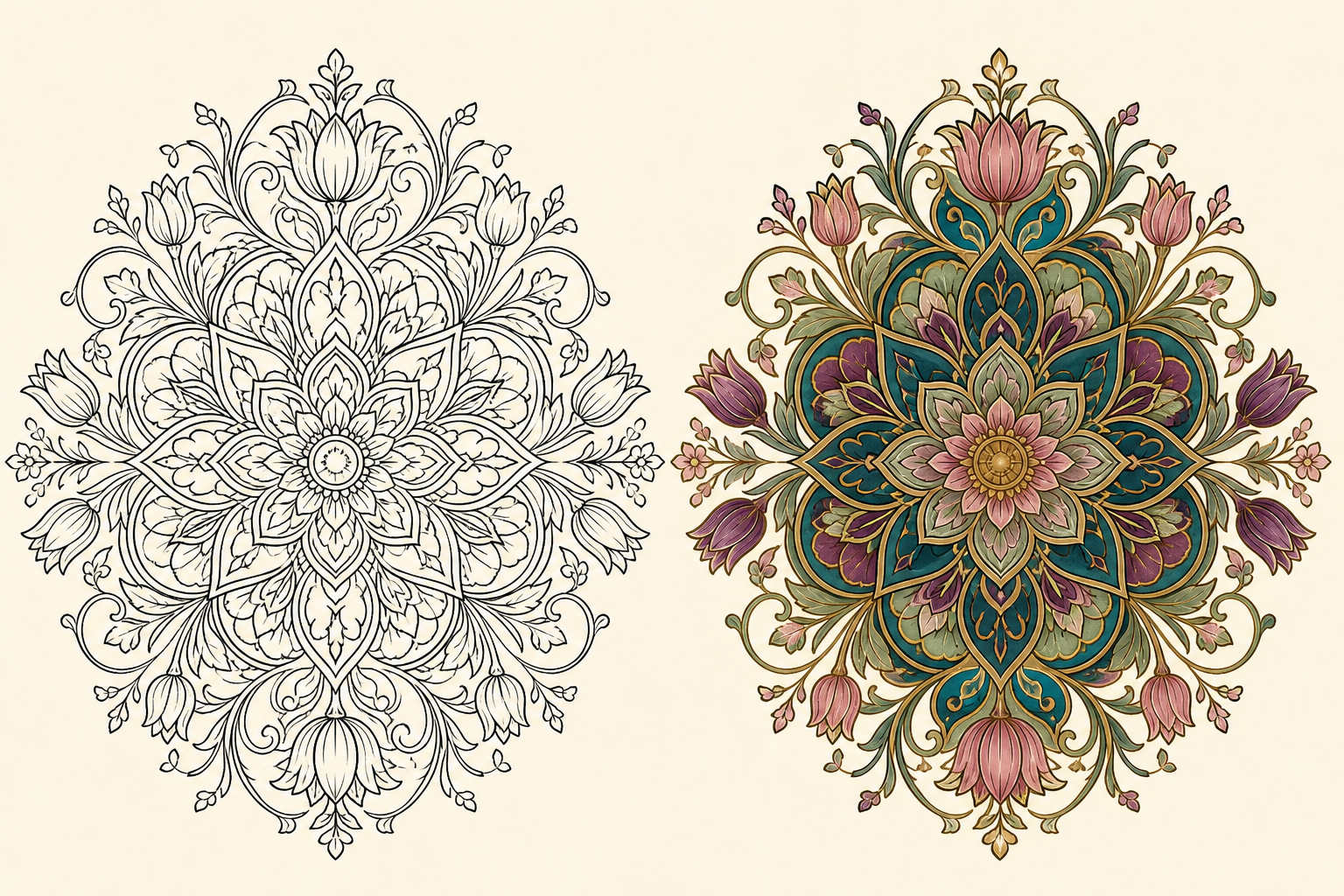
Garden Jewel
Garden Nouveau
Curling vines, tulip petals, and leafy symmetry bring an art-nouveau silhouette to an intricate coloring page.
Use this color direction05 / OCEAN TIDELINE ART → COLOR REFERENCE
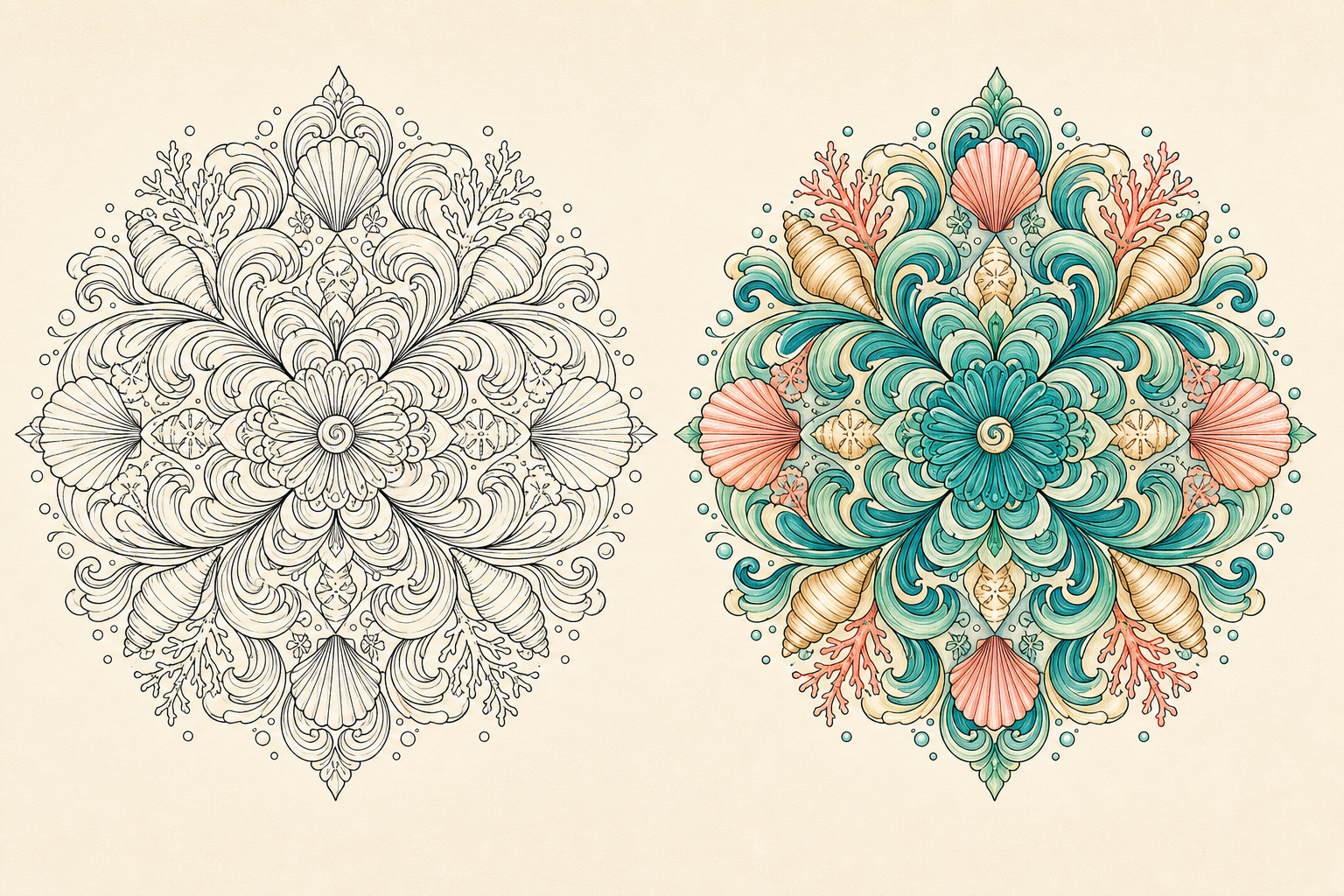
Ocean Tide
Ocean Tide
Wave ribbons, shells, and coral details make a fluid mandala that feels fresh, coastal, and full of movement.
Use this color direction06 / VELVET ROSELINE ART → COLOR REFERENCE
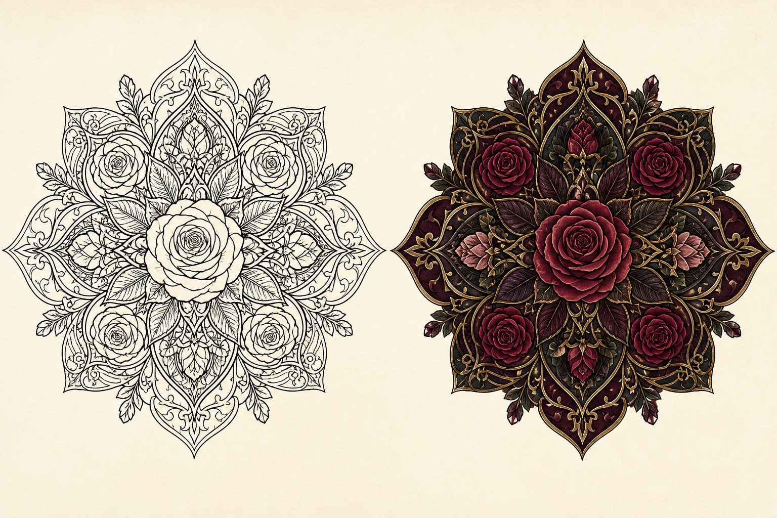
Velvet Rose
Gothic Rose
Layered roses, dark leaves, and ornamental filigree create a dramatic color direction with a luxurious edge.
Use this color direction07 / MOSAIC SUNLINE ART → COLOR REFERENCE
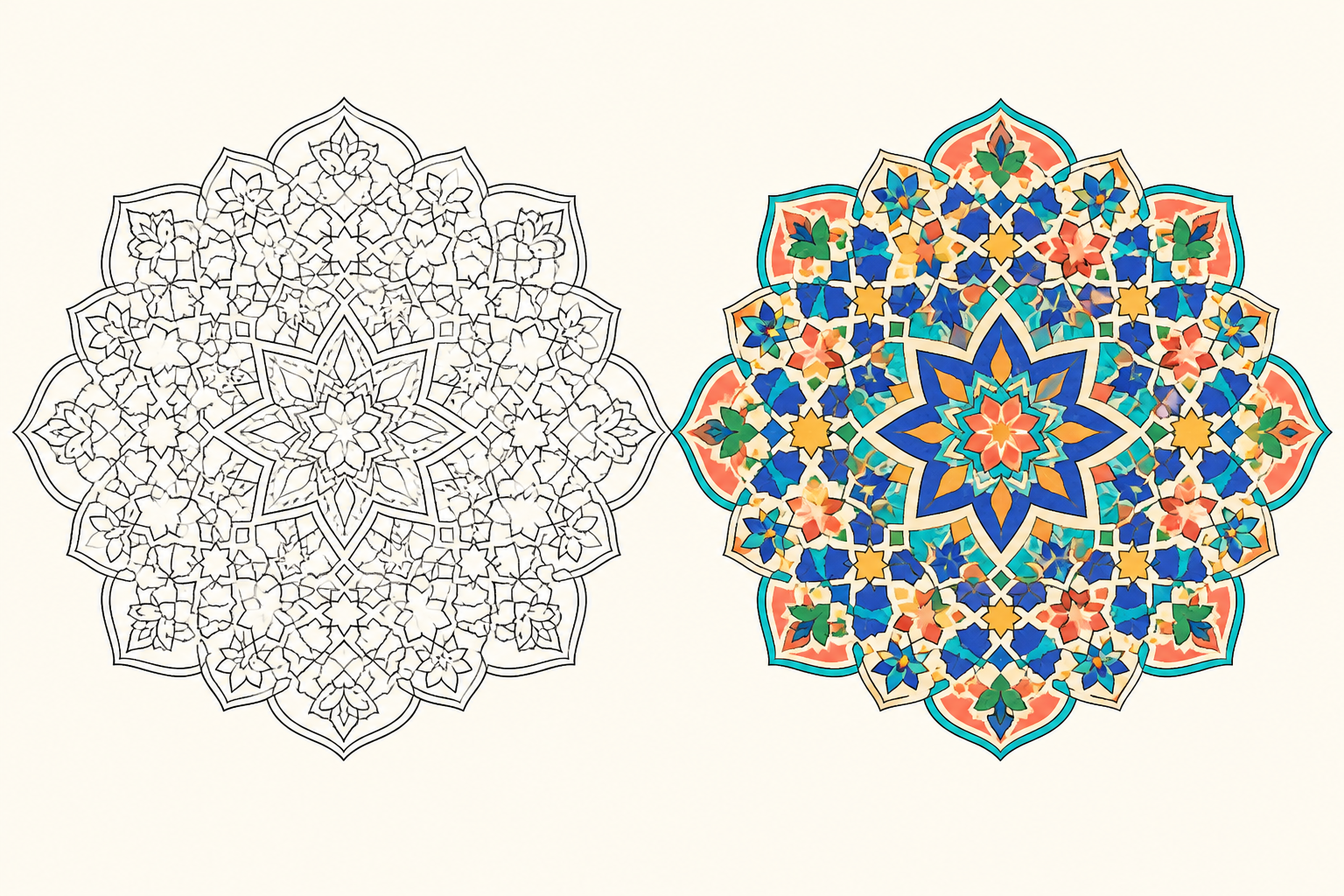
Mosaic Sun
Mosaic Sun
Interlocking tiles, scalloped arches, and eight-point stars bring a Mediterranean mosaic rhythm to the page.
Use this color direction08 / DECO GLAMOURLINE ART → COLOR REFERENCE
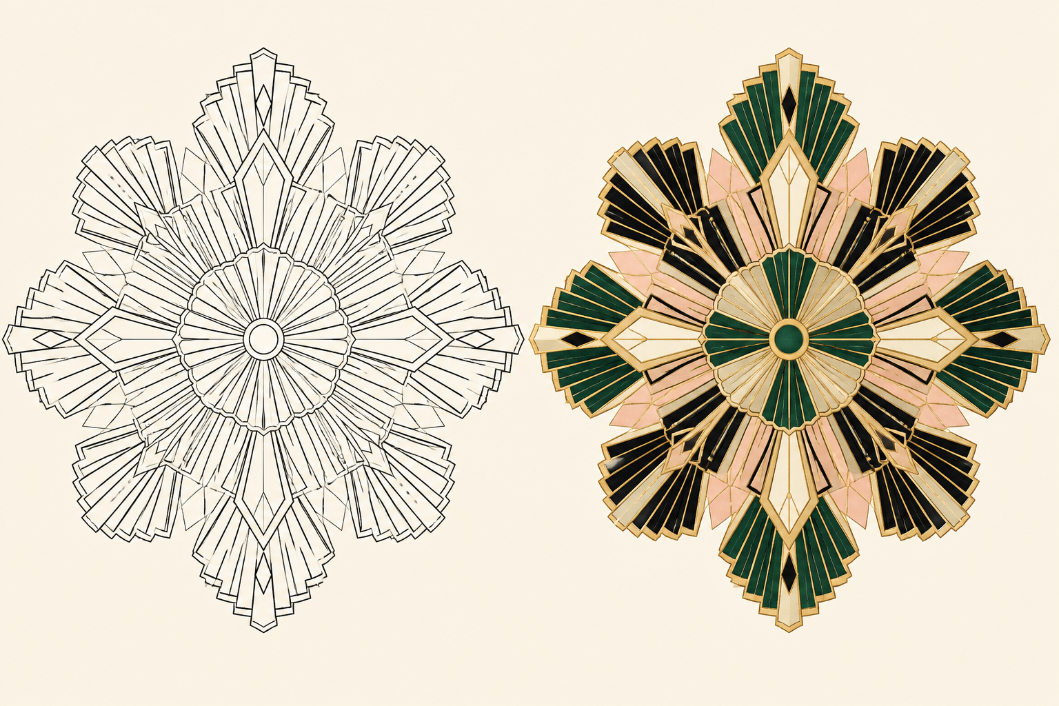
Deco Glamour
Deco Fan
Stepped fans, geometric rays, and champagne-gold accents turn this mandala into a polished Art Deco statement.
Use this color direction09 / WOODLANDLINE ART → COLOR REFERENCE
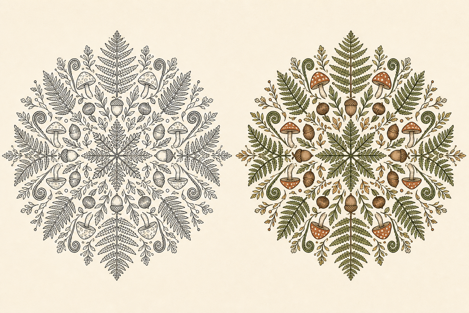
Woodland
Woodland Fern
Ferns, acorns, mushrooms, and seed pods create a cozy forest-floor composition with natural repetition.
Use this color direction10 / CANDY GARDENLINE ART → COLOR REFERENCE
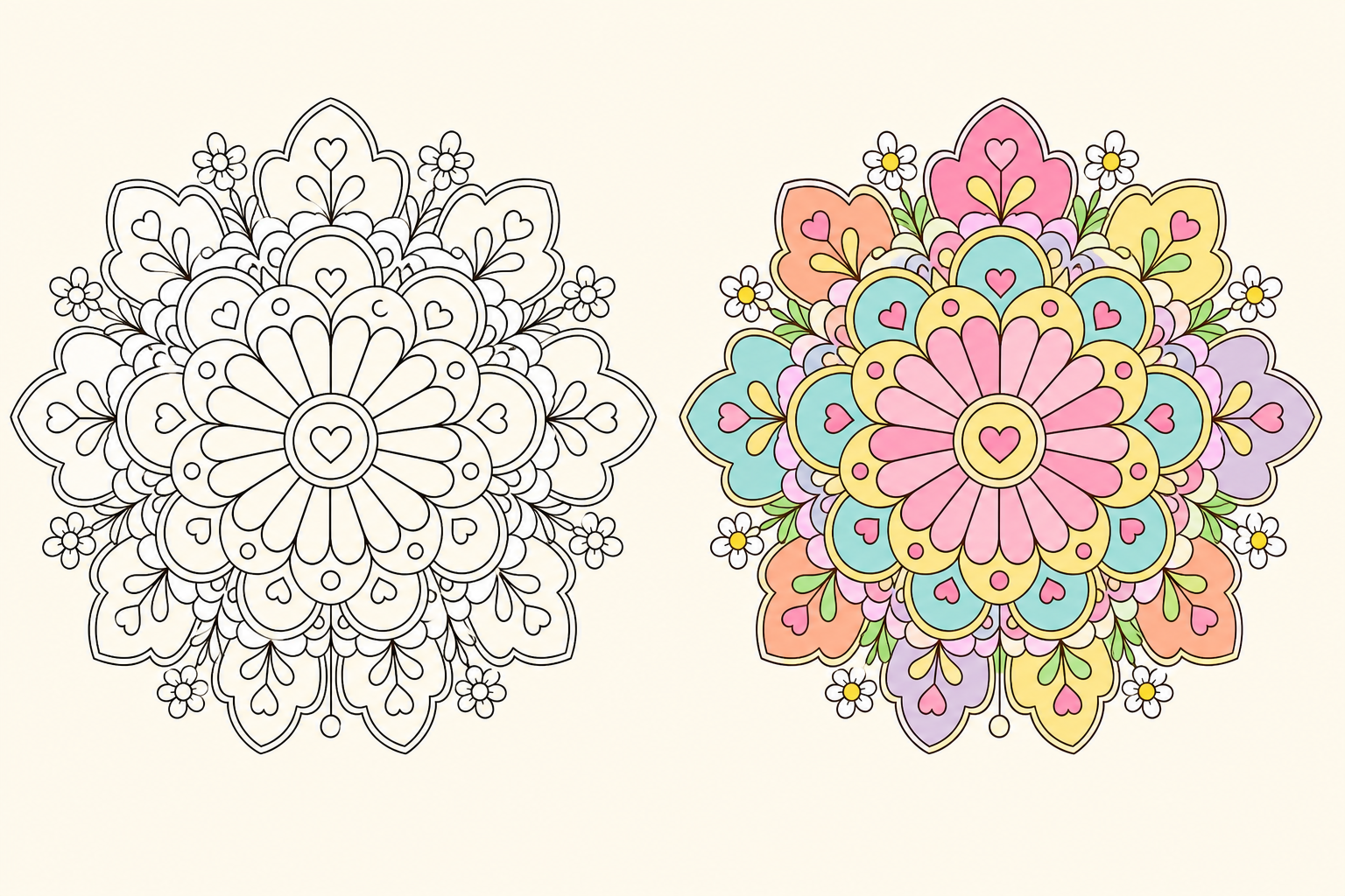
Candy Garden
Candy Garden
Rounded daisies, tiny hearts, and cheerful rings make this friendly mandala feel bright, light, and approachable.
Use this color direction11 / ZEN CIRCLELINE ART → COLOR REFERENCE
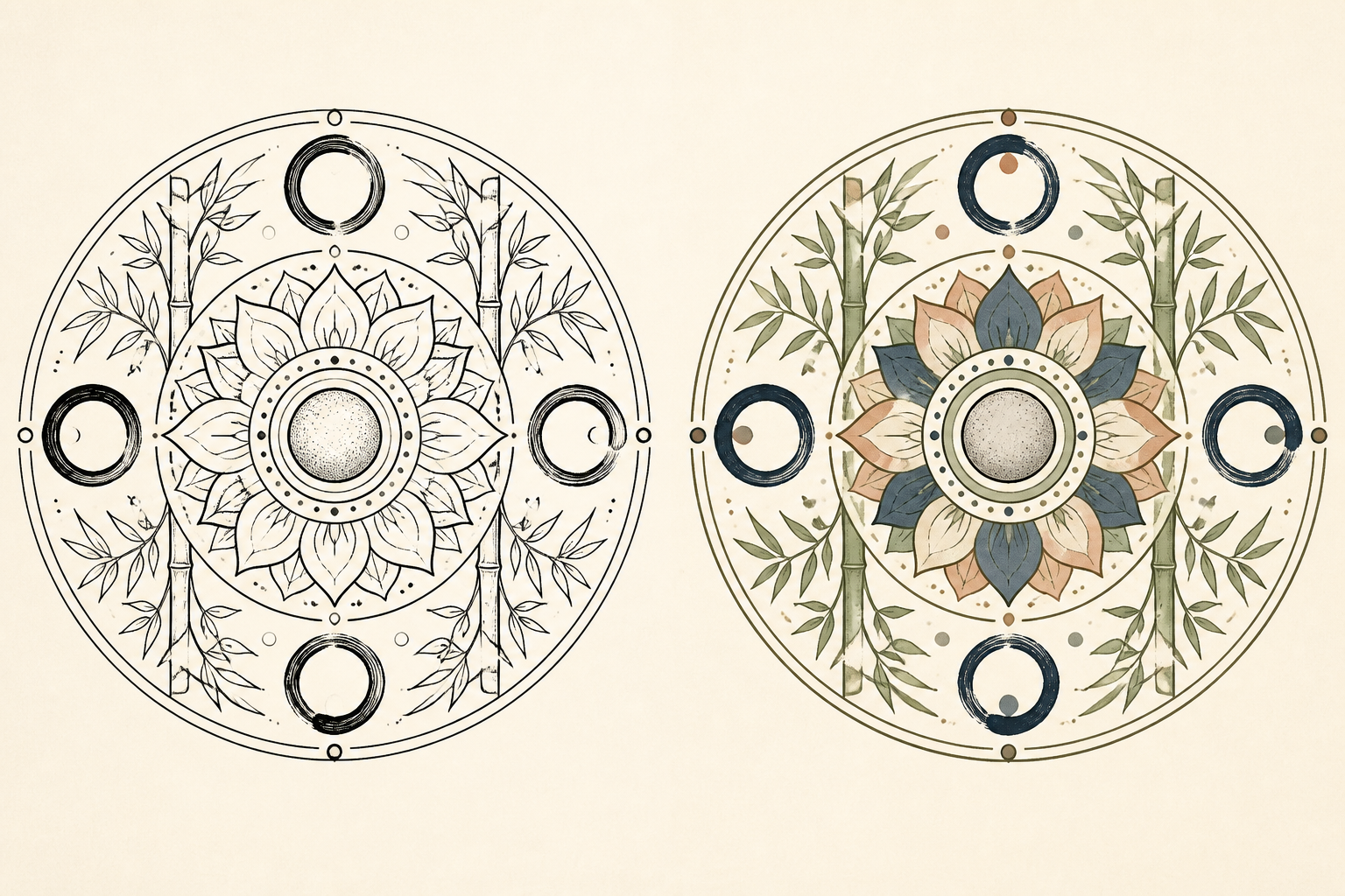
Zen Circle
Zen Circle
Spacious ink rings, bamboo leaves, and a stone-like center create a slower, quieter color direction.
Use this color direction12 / PRISM FLARELINE ART → COLOR REFERENCE
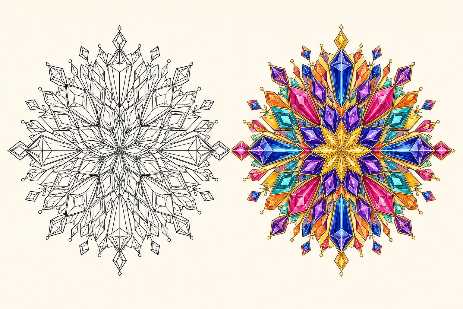
Prism Flare
Prism Flare
Crystal facets, mirrored diamonds, and jewel-like shards create the most energetic color direction in the set.
Use this color directionA CREATIVE WELLBEING ACTIVITY
Why Adults Enjoy Coloring Mandalas
Potential benefits of mandala coloring for adults
Focused Attention
Following repeated shapes and rings gives your eyes and hands one small area to work on at a time.
Structured Creativity
A mandala gives you a clear framework while leaving room to choose your own mood, contrast, and color rhythm.
A Screen-Free Pause
Printing a line drawing turns coloring into a simple offline activity between busy moments.
A Satisfying Sense of Progress
Repeating colors and completing sections makes a detailed page feel approachable, one ring at a time.
Mandala coloring can offer a calming, focused creative break. Some studies have reported short-term reductions in stress or anxiety, although results vary and the overall evidence remains limited. Coloring is a creative wellbeing activity, not a replacement for professional mental health care.
COLOR IDEAS FOR INTRICATE PATTERNS
How to Choose Colors for a Mandala
Start with the mood you want to create. Use the color relationship as a starting point, then repeat the same colors around the center to keep the finished mandala balanced.
Calm & Relaxing
Analogous, Cool, or PastelSoft, gentle color relationships for slow and soothing coloring.
Bold & Energetic
Complementary, Triadic, or Jewel TonesStronger contrast for dramatic, lively, and attention-grabbing mandalas.
Balanced & Sophisticated
Monochrome, Earth Tones, or RetroControlled color relationships for a grounded and coordinated finish.
Simple rule: Use fewer colors for a calm result, repeat colors around the center, and reserve your darkest value for a few areas that need focus.
MANDALA COLOR IDEAS FAQ
Mandala Color Ideas and Color Scheme FAQ
Find answers about mandala color ideas, uploads, finished references, printing, and the best line art for dependable results.
How do I choose colors for a mandala?
Start with the mood you want, then choose a color relationship that supports it. Pastel and cool palettes feel gentle, complementary and jewel-tone palettes create contrast, and earth tones create a grounded finish.
What color schemes work best for intricate mandalas?
Use a limited palette with repeated colors around the center. Analogous, monochrome, earth-tone, and jewel-tone palettes can keep detailed sections connected instead of visually competing.
Can I upload my own mandala coloring page?
Yes. Upload a JPG, PNG, or WebP line drawing up to 10 MB. Clear black outlines on a light background with mostly enclosed regions work best.
Will the tool change my original line art?
No. The original line art remains available separately from the generated color reference. The colorized result is intended as a guide for coloring by hand or digitally.
Will the finished reference exactly match my pencils or markers?
Not exactly. Colors on screen are approximate, and physical pencils, markers, paper, and lighting can produce slightly different results. Use the finished image as a coordinated direction rather than an exact color guarantee.
How many colors should I use in a mandala?
Five coordinated colors are a useful starting point for a detailed mandala. Repeat the colors across sections, then use light and dark values to create rhythm and contrast.
What is the difference between a palette generator and this tool?
A palette generator gives you color swatches. This tool also applies the selected color direction across a mandala so you can preview the overall reference before coloring.
Can I print the finished color reference?
Yes. When the Finished Look is ready, you can download the PNG color reference and use it beside the original line art while coloring or printing.
Is choosing a palette free?
Browsing the palette directions and sample previews is free. Creating a Finished Look uses 5 credits; new accounts can use welcome credits for one Personal Finished Look, or a Studio allowance when one remains.
What type of line art works best?
Crisp black outlines on a white or light background produce the most dependable results. Open, overlapping, heavily shaded, or unclear boundaries can affect color placement.
SOURCES & FURTHER READING
Sources & Further Reading
These references provide cultural background and context for the cautious wellbeing language on this page.
The Metropolitan Museum of Art: Mandalas: Mapping the Buddhist Art of TibetCultural background on mandalas and Tibetan Buddhist art.Does Mandala Art Improve Psychological Well-Being in Patients?A systematic review that describes preliminary findings and limits the certainty of therapeutic claims.Coloring Activities for Anxiety Reduction and Mood Improvement in Taiwanese Community-Dwelling Older AdultsA randomized study comparing mandala coloring with other coloring, drawing, and reading activities.